One of the aims of calculus is to be able to tell as much as possible about a given function. In particular, we want to be able to sketch a graph of it so that it has all the important features right. In this section we identify all ingredients that can help in drawing the right picture. We will focus here on the ideas; details on how some parts are done can be found in further sections.
Proper graph sketching works on two levels. First, one should know how to solve partial problems, for instance how to find the domain, determine asymptotes, investigate monotonicity etc. These skills are practiced in other parts of Math Tutor. But then, after mastering them, one also should be able to put all the information obtained in this way into a meaningful whole. That is exactly the focus of this section.
One last remark before we start. The procedure outlined below works for "nice" functions, which basically means functions whose domains can be split into subintervals so that on each of these intervals the function is at least twice differentiable (in particular continuous). Of course, not all functions work this way (see e.g. Dirichlet functions in Functions - Theory - Elementary functions), these have to be handled individually.
We always start by determining the domain of the given function f (see Introduction in Functions - Theory - Real functions, or Domain in Functions - Methods Survey - Basic properties). This determines our working space and incidentally helps us plan the basic outline of the graph, see the paragraph about choosing the scale below.
To anchor the graph in space we use points. Generally, the more points the better, but it would be pointless to just substitute lots of randomly chosen values of x into f and plot them (although it would not hurt either). Much smarter strategy is to plot points that are important, where something happens. We will get some such points below, here we look for one specific kind, the intercepts with coordinate axes.
To get the y-intercept, we simply substitute 0 into f (if
possible).
To get the x-intercept, we solve the equation
It also helps to check on symmetry of the function. If you know that your function is odd or even, it might save your time, since then it is enough to draw one half of the graph and fill in the other half by symmetry. Or you can use it as a safety check, do the whole graph in the standard way and ten check that the data you obtain satisfy the required symmetry.
Sometimes we find out that a function is periodic. This is another great help, since then it is enough to focus on just one period.
The last preparatory step is provisional determination of continuity on intervals. Continuity is important for graph sketching, since the uninterrupted parts of the graph correspond exactly to intervals on which f is continuous. While for functions that are given by one formula this is usually pretty straightforward (such a function is usually continuous on its domain), it gets more interesting when we graph a split function, see the appropriate section. In subsequent calculations, the domain is often split into intervals and we work on each interval separately. While usually we just take the intervals that constitute the domain, it actually works only in cases where these intervals correspond to continuity. Sometimes some of these intervals have to be further split according to continuity, which usually happens when we have a function defined by cases and we have different definitions at different parts of one interval from the domain. Therefore we will further talk about "intervals from the domain or the definition of the function".
A typical graph consists of one or several uninterrupted curves. The points that we found above (e.g. intercepts) or in the parts below will "fix" middle parts of these curves. However, they rarely provide information about how these pieces look at their "ends". To get this information, we look at all intervals from the domain or the definition and find the limits at all endpoints (see Functions - Theory - Limits, or Functions - Methods Survey - Limits). If some endpoints are included (the relevant interval is closed there), then also the value at this point is important.
This information can be used in several ways. First, it tells us roughly where the ends should go. To refine this information further we determine asymptotes (see also Asymptotes in Methods Survey - Graphing). Vertical and horizontal asymptotes are just names for some results of limits at endpoints, but for oblique asymptotes we need to do more work and they also bring more information about how the graph should look like.
We also use information about limits at proper endpoints (if there are any) in determining continuity. We already looked at intervals of continuity before, now we have the information needed to determine one-sided continuity at proper endpoints of these intervals and for classification of discontinuities (if present). Sometimes we may find out that adjacent intervals of continuity guessed above may actually be connected into one, which is useful to know, but in subsequent calculations we will still treat such intervals separately, because the reason for splitting them above will most likely still play some role.
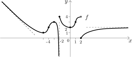
Example:
Assume that we have a function f with the following data: It
has the whole real line as its domain, it is not symmetric nor periodic.
Intercepts:
We also assume that this function is continuous on
![]()
Some conclusions: There is a horizontal asymptote
The function is continuous at −2 from the right and at 2 from the right, it has a discontinuity of the 3rd kind at −2 and a jump discontinuity at 2.
So this is the kind of information one can have at this stage. How do we put it into a picture?

After we do the above steps, we know how many uninterrupted curves we have to draw and over which intervals they lie. We also know where these curves end thanks to the limits described above. The next step is to find out what roughly goes on between the ends. The first and most important thing to find is the intervals of monotonicity and local extrema, see the next section or Monotonicity and local extrema in Methods Survey - Graphing).
In a typical case the intervals from the domain or definition get further split into smaller intervals, on each of which the function is strictly monotone. We also learn of "hills" and "dips" of the curves, that is, local maxima and minima. After we mark these extremal points, we can connect the ends of individual curves and the points in graph by temporary lines and we get a pretty good idea how the graph looks like.
Example:
Assume that in the above example we get the following chart

and we also identify

It remains to polish up the graph, that is, to find out how it curves, which is the topic of the next part.
Concavity and points of inflection (see the appropriate section or Concavity in Methods Survey - Graphing) refine the graph.
Example:
Assume that in the above example we get the following chart

and we also identify
Note that the concavity information is one level of importance down from monotonicity information. What do we mean by this? Imagine that you have the knowledge of concavity, that is, you know the points of inflection and intervals of concavity. Can you sketch a reasonably good picture of the graph? The answer is no, for instance in the following picture, both graphs have the same concavity properties, yet they look very much different.

On the other hand, knowing monotonicity and local extrema, we do have a pretty good idea about the function as we saw above. We may not know exactly how the dotted parts should go, but the trends are all there, concavity just makes the picture more precise. For instance, in the example above we might get different concavity and a picture like this.

Note that this picture and the example above both have the same monotonicity. They are somewhat different, but not substantially so, so changing concavity does not influence the resulting graph too much.
When we start drawing a graph, one of the first things to decide on is the scale. You want the graph as telling as possible, in other words, you would like to pick the largest possible scale. If the domain is a "small" set, you can stretch the x-axis wide since you do not need values of x outside the domain. The other important consideration for choosing the right scale is what points should be marked (intercepts, local extrema, points of inflection), since we do not want them too crowded in our picture.
Sometimes this is easy, but one may have a situation when there are several interesting points close to one another at one place and then some other interesting points quite far off. To have both groups in the picture one should choose a rough scale, but then the tight group of points gets too crowded to really show properly. One possible way out is to use a scale that is not regular. Typically, one would use a very fine scale at the origin and then gradually make it rougher and rougher, one possibility is the logarithmic scale.
Similarly one can have a problem with getting all values of f in. This is often handled by choosing different scale for the x and y axes, which distorts the precise shape, but it shows all the important information properly.
The data that go into the graph sketching follow a natural path. First we explore f itself as outlined in the first two parts (domain, intercepts, continuity, limits at endpoints, asymptotes etc.). Then we look at the derivative f ′ and get the monotonicity and local extrema information, it also helps to know one-sided derivatives where appropriate (see Example below). Finally we pass to the second derivative f ′′ and get the concavity information.
There are essentially two basic approaches to sketching graphs. One is to do the procedure as outlined in the Example above, we do the picture simultaneously with our calculations, at each step making the picture more precise. The other approach is to first do all the calculations and get all the information. Then we do the sketch in two steps, to show them we will draw again the function above.
Example: Here we use the date above to draw the graph in a different way. In the first step we put the information about points and limits/asymptotes to anchor the graph in space. We obtain a picture similar to the one we had above after the limit step, but now we also have points from the other two steps in it (local extrema and inflection points).

In the second step we combine the two charts we had in monotonicity and concavity steps into one.

This chart follows directly from the recommended method of investigating monotonicity and concavity and note that it already gives you a fairly good idea of how the graph should flow. You just "hang" this shape on the anchor points already in the picture and you are done. This is actually my preferred method.
Whichever way you choose, there is one more thing you can do to make the
graph more precise. If some parts of a graph "end" at proper points, it helps
to know the value of one-sided derivatives so that it can be drawn better. In
the example above we assume that we obtained
Remark:
When putting all the information together it pays off to think how it fits
together. When you make a mistake in calculations, it often shows up by giving
you contradictory tendencies. For instance, in the example above, if your
calculations give you that this f is concave up on some interval of
the form

Similarly, once we know that f passes through the point
Also, once we find out that f has the asymptote

Remark: Above we showed that monotonicity is more important for the shape than concavity. In other words, we get a first order information from the first derivative and refine it with second order information from the second derivative. One can go further and try the third derivative to get some third order info, thus making the sketch more precise, then the fourth order etc, getting the picture closer and closer to what the graph really is. However, these higher levels are very different to imagine and use in practice, since they do not correspond to clear-cut notions. For instance, the third derivative tells us how fast a function is curving at places where it is concave up or down. Hard to imagine, which is why this kind of info is not used when sketching graphs. However, such higher order information is important when using derivatives to approximate functions (see the Taylor polynomial).